Unlock the secrets to professional-looking designs with this comprehensive guide to graphic design grid systems. Learn how these powerful tools bring order and elegance to your layouts, improving readability and visual appeal. From basic principles to advanced techniques, we'll cover everything you need to master grid systems and elevate your design skills. Prepare to create stunning, consistent, and impactful visuals.
Step-by-Step Instructions
-
Fundamental Grid Systems
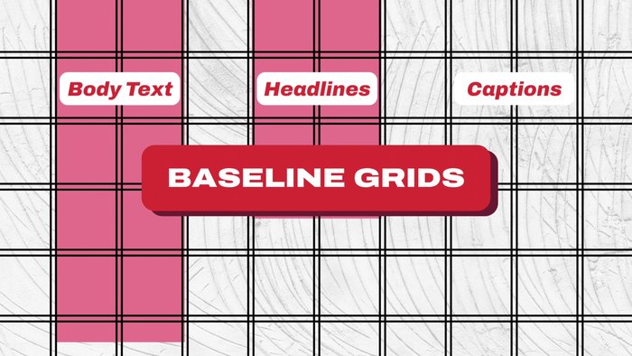
- Aligns body text, headlines, and captions across columns for clean, consistent spacing and improved readability.
- Divides the page into equal vertical sections, offering flexibility for organizing content while maintaining balance and structure.
- Each product image or graphic gets its own module (image, title, description, etc.), ensuring consistency across pages while showcasing different content types.
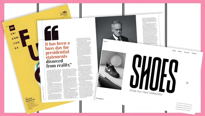
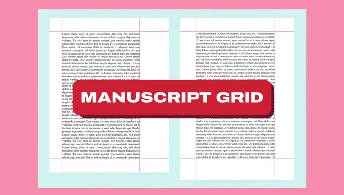
- A single-column grid for organizing text flow in books, using margins for notes or images to enhance readability.

Fundamental Grid Systems -
Grids for Hierarchy and Visual Appeal
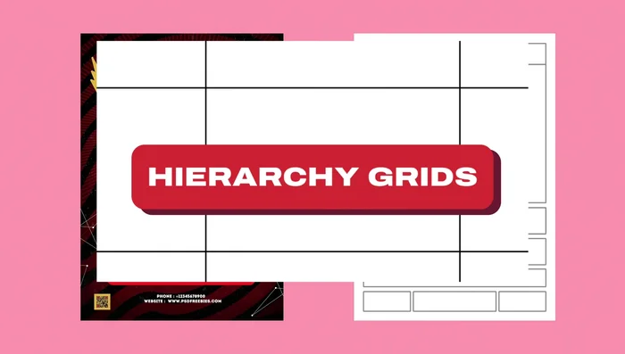
- Places large images or important text in blocks (headlines, call-to-actions), while secondary information (navigation, footer) is less prominent.
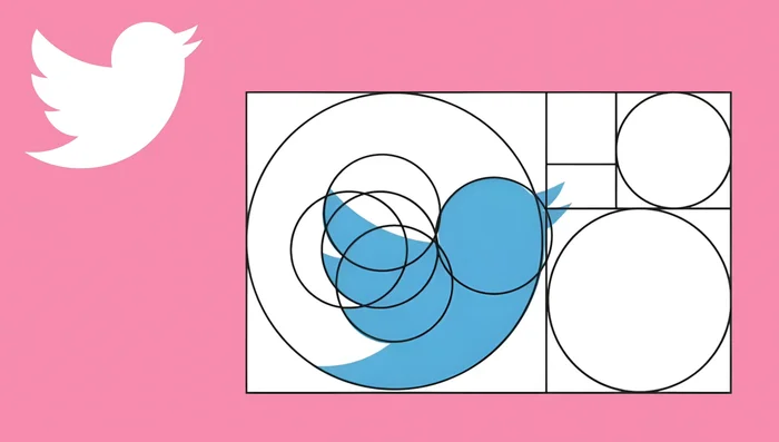
- Uses the golden ratio (approximately 1:1.618) to create balanced proportions in logo design and other visuals.
Grids for Hierarchy and Visual Appeal -
Dynamic and Creative Grid Layouts
- Breaks away from balanced, symmetrical systems, allowing for dynamic layouts where key elements (hero image, headline) dominate.
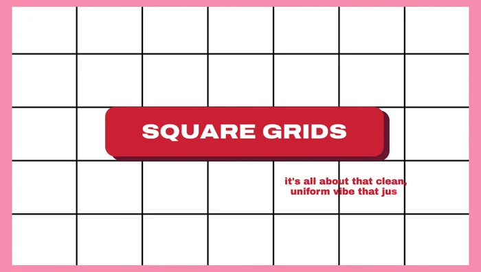
- Creates a clean, uniform look, ideal for galleries or websites showcasing images or posts in neat squares.
- Divides the design into nine equal parts (two horizontal and two vertical lines) for natural, engaging element placement.
Dynamic and Creative Grid Layouts -
Advanced and Combined Grid Techniques
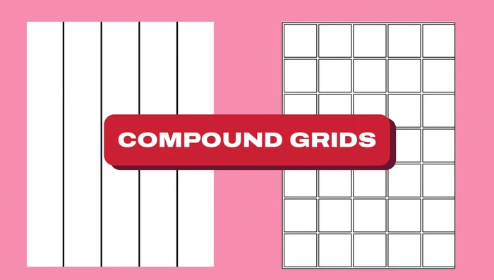
- Combines different grid systems (e.g., column grid for product listings and modular grid for details) for flexibility and organization.
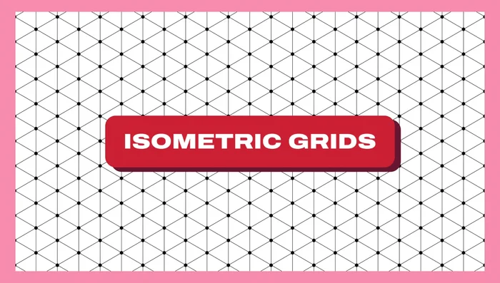
- Adds a 3D vibe to illustrations and designs, creating depth and dimension for infographics and similar applications.
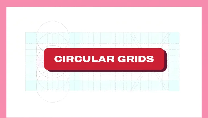
- Useful for logos and designs with round, organic shapes, emphasizing symmetry and balance.
- Creates geometric patterns or positions elements on a product box, adding a unique and dynamic look.
Advanced and Combined Grid Techniques

Tips
- Baseline Grid Tip: Use multiples of your base leading for a harmonious hierarchy (e.g., 28-point headlines with 14-point body text).
- Column Grid Tip: Overlap elements (images, text) across columns for visual interest.
- Modular Grid Tip: Vary module size based on product category or importance to highlight certain items.
- Hierarchy Grid Tip: Create contrast between primary and secondary elements using color and size.
- Golden Ratio Grid Tip: Don't rigidly adhere to the golden ratio; use it as a starting point and adjust as needed.
Common Mistakes to Avoid
1. Ignoring the Grid
Reason: Designers sometimes neglect the grid system, leading to inconsistent spacing, unbalanced layouts, and a visually chaotic result.
Solution: Establish a clear grid system early in the design process and adhere to it throughout.
2. Using an Inappropriate Grid
Reason: Choosing a grid that doesn't suit the content or design style can result in awkward layouts and poor visual hierarchy.
Solution: Select a grid structure that complements the content and aesthetic goals of the design.
FAQs
What are the different types of grid systems?
There are several, but the most common are column-based grids (offering vertical organization), modular grids (using repeating modules for flexible layouts), and hierarchical grids (combining different grid types for complex designs). The best choice depends on the project's complexity and desired aesthetic.